Delve into the fascinating world where interior colors play a crucial role in shaping our emotions and mood. Discover how a simple choice of color can transform a space into a haven of tranquility or a burst of energy.
Explore the intricate relationship between colors and emotions as we unravel the mysteries behind interior design.
The Connection Between Interior Colors and Mood
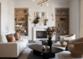
When it comes to interior design, colors play a significant role in influencing our emotions and overall mood within a space. Different colors have the power to evoke specific feelings and reactions, making it crucial to choose the right color scheme for each room.From calming blues to energizing yellows, the choice of colors in interior design can greatly impact the ambiance and atmosphere of a space.
Warm colors like red, orange, and yellow are known to create a sense of warmth and intimacy, making them ideal for living rooms and dining areas. On the other hand, cool colors such as blue, green, and purple are often used in bedrooms and bathrooms to promote relaxation and tranquility.The psychological impact of warm versus cool colors is also worth noting.
Warm colors tend to energize and stimulate the mind, making them suitable for areas where social interaction and activity are encouraged. Cool colors, on the other hand, have a calming effect and can help reduce stress and anxiety, perfect for spaces where relaxation and concentration are key.
Examples of Colors and Their Emotional Impact
- Red: Known to stimulate appetite and create a sense of excitement. Often used in dining areas or kitchens.
- Blue: Promotes a feeling of calmness and serenity, making it a popular choice for bedrooms and bathrooms.
- Yellow: Evokes feelings of happiness and positivity, making it a great option for kitchens or home offices.
- Green: Symbolizes growth and balance, ideal for creating a sense of harmony in living spaces.
- Purple: Associated with luxury and creativity, often used in bedrooms or home offices to inspire imagination.
Cultural Influences on Color Perception
Cultural background plays a significant role in shaping how individuals perceive colors. The meanings and associations attached to different colors can vary widely across cultures, impacting people's emotional responses and preferences in interior design.
Examples of Cultural Color Associations
In many Western cultures, the color white is often associated with purity, innocence, and simplicity. However, in some Eastern cultures, white is linked to mourning and death. Similarly, red is commonly associated with passion and love in Western cultures, while in some Asian cultures, it symbolizes luck and prosperity.
- In India, the color yellow is traditionally associated with happiness, peace, and spirituality. It is often used in religious ceremonies and festivals to symbolize enlightenment and positivity.
- In African cultures, the color green is often associated with fertility, growth, and prosperity. It represents the lush vegetation and abundant natural resources of the continent.
- In Latin American cultures, the color purple is often associated with royalty, luxury, and wealth. It symbolizes power and sophistication.
Cultural Norms in Interior Design
Cultural norms heavily influence color choices in interior design, shaping the mood and atmosphere of a space. For example, in many Asian cultures, red is a popular color choice for interior spaces as it is believed to bring good luck and ward off evil spirits.
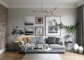
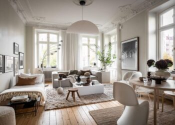
On the other hand, in Scandinavian design, neutral colors like white, beige, and light gray are preferred to create a sense of simplicity and tranquility.
Understanding the cultural significance of colors is essential when designing spaces that cater to diverse populations
.
Color Theory and Its Application in Interior Design
Understanding color theory is essential in interior design as it helps create harmonious spaces that evoke specific moods and emotions. By applying the principles of color theory, designers can transform the look and feel of a room.
Basics of Color Theory
Color theory is based on the color wheel, which consists of primary colors (red, blue, yellow), secondary colors (green, orange, purple), and tertiary colors (mix of primary and secondary colors). Complementary colors are opposite each other on the color wheel and create a vibrant contrast, while analogous colors are next to each other and create a harmonious palette.
Impact of Color Combinations on Mood
- Warm colors like red, orange, and yellow can create a cozy and energetic atmosphere, ideal for social spaces like living rooms and kitchens.
- Cool colors like blue, green, and purple have a calming effect, making them suitable for bedrooms and offices where relaxation and focus are important.
- Neutral colors like white, beige, and gray provide a versatile backdrop that can be paired with bolder hues to add depth and sophistication to a room.
Use of Color Schemes to Create Atmospheres
- Monochromatic color schemes involve using variations of a single color, creating a sense of harmony and simplicity.
- Analogous color schemes use colors that are adjacent on the color wheel, providing a cohesive and soothing palette.
- Complementary color schemes combine colors that are opposite each other on the color wheel, creating a dynamic and visually striking look.
Personal Preferences and Individual Responses to Colors
Personal experiences play a significant role in how individuals respond to colors. These experiences can be shaped by cultural influences, childhood memories, or even personal associations with certain hues. As a result, people may have unique emotional reactions to different colors based on their past encounters with them.
Role of Individual Preferences in Selecting Colors for Interior Spaces
Individual preferences heavily influence the selection of colors for interior spaces. Some individuals may gravitate towards soothing blues and greens to create a sense of calm, while others may opt for vibrant reds and yellows to energize a room. Ultimately, the colors chosen for a space should reflect the individual's tastes and desired mood.
Impact of Past Experiences on Mood and Well-Being
Past experiences with certain colors can have a profound effect on mood and well-being. For example, someone who associates the color yellow with happiness and positivity may feel uplifted when surrounded by this hue. On the other hand, individuals with negative past experiences linked to a specific color may feel discomfort or unease in its presence.
Final Conclusion

As we conclude our exploration of The Psychology Behind Interior Colors and Mood, it's evident that the colors we surround ourselves with have a profound impact on our well-being. From calming blues to vibrant yellows, each hue tells a unique story that influences our daily lives.
FAQs
How do different colors influence our mood?
Colors can evoke specific emotions - for example, blue is often associated with calmness and relaxation, while red can signify energy and passion.
Can cultural background impact how we perceive colors?
Absolutely, cultural influences play a significant role in color perception. Different cultures may associate colors with varying emotions and meanings.
How do personal experiences affect our responses to colors?
Personal experiences shape our color preferences and reactions. Positive or negative associations with certain colors can impact our mood and overall well-being.


![KITCHEN DESIGN MISTAKES [Common design mistakes to avoid] - YouTube](https://interior.iwosumbar.com/wp-content/uploads/2025/11/10-Common-Kitchen-Design-Mistakes-to-Avoid-Cliq-Studios-120x86.jpg)
